YMCA
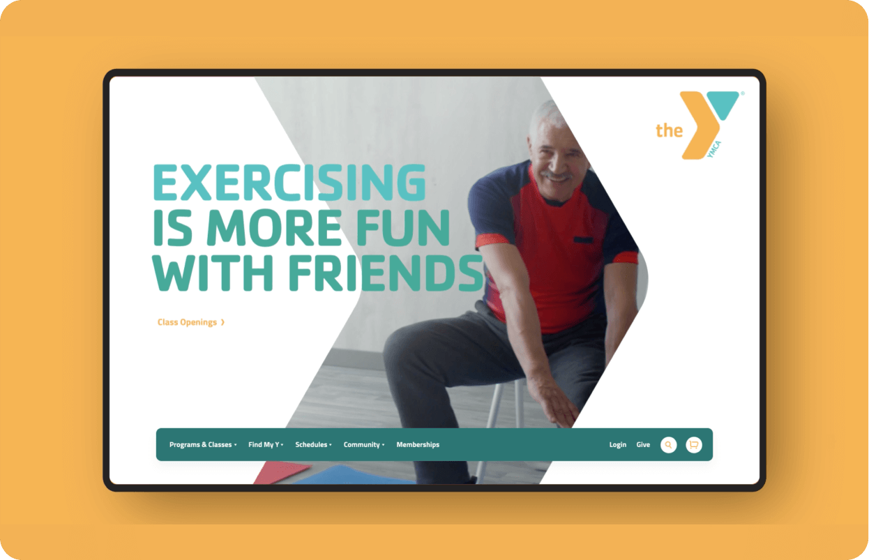
The Y needed a modern, brand-focused digital presence that allows them to update content freely and respond quickly with digital campaigns.
Through our research, we identified what makes the Y a choice gym destination for its members and determined that a slick website with the latest design trends would contradict the essence of what makes the Y a home to so many. This became our inspiration. In our restraint of color and animation we found a connection back to the members.
The Y needed to evoke energy and life, but for a site with 500+ pages, the vast majority were static and primarily text. So we created the concept of “speed stripes.” As the viewer scrolls through a page, certain sections have animated tails of color corresponding with the logo.
The new design aims to increase revenue through online and offline membership sales, program sales, and donations to family centers across the region. The website gives the Y team a unified voice and platform to effectively communicate who the organization is, what it does, and the impact it makes.
How can you update a legacy brand without changing the logo?

The Y has a unique set of five brandmarks, which, when interchanged across its programs and services, offer a dynamic, energetic face to the organization. We enjoyed taking it further by offering new meaning to the triangle and arrow in which the Y is built, as well as the characteristic “sturdiness” of the letterforms.

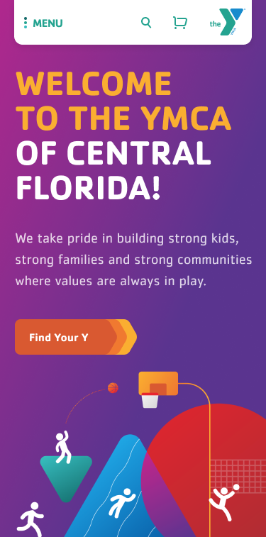

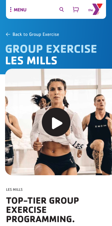

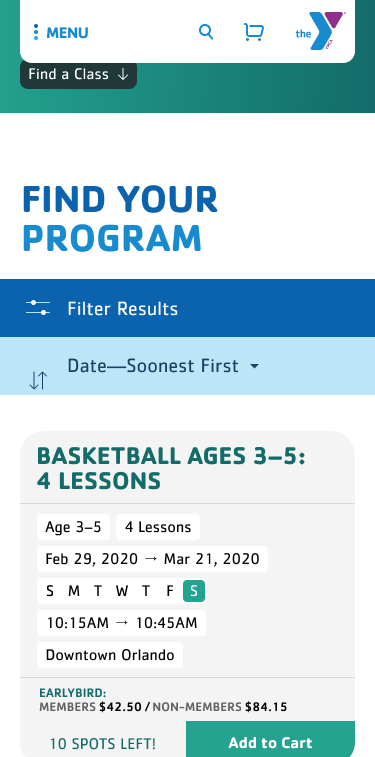

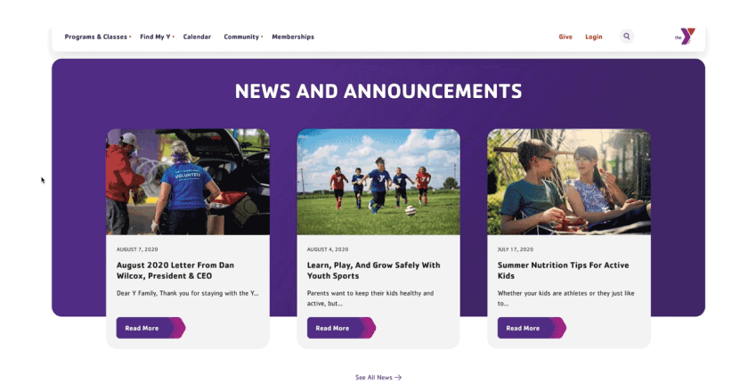
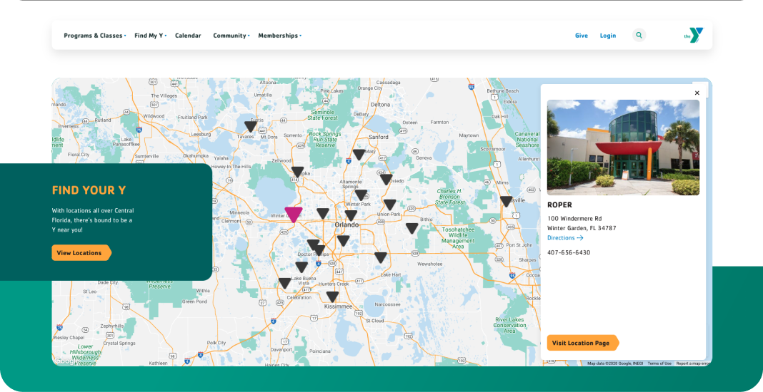
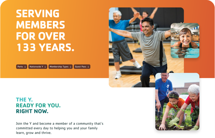
The content of every page is set up using a library of 40+ custom-built components, so the Y can create compelling and rich content on the fly.
Launched in August 2020, the Y’s new website acts as a catalyst for sustainable financial growth through ecommerce, integrated systems, optimized journeys, agility, and centralized management.
