TLC Engineering

A nationally acclaimed engineering firm needed a more dynamic method of showcasing their portfolio and attracting talent.

Speed and responsiveness were major priorities for TLC. Staged on WordPress, their website contained more than 300 projects, 1000+ items in the media library, and a roster of more than 80 team members.

Now TLC can easily share a link at a client lunch or walk a vendor through a project site on their phone without worrying about technical difficulties. With smooth navigation and fast download speeds, viewers get excited and invested in the content they’re seeing.

Winner
  • Silver Local Website ADDY
  • Gold District Website ADDY

How can we plot more intuitive, engaging user journeys that draw visitors further into the world of engineering?
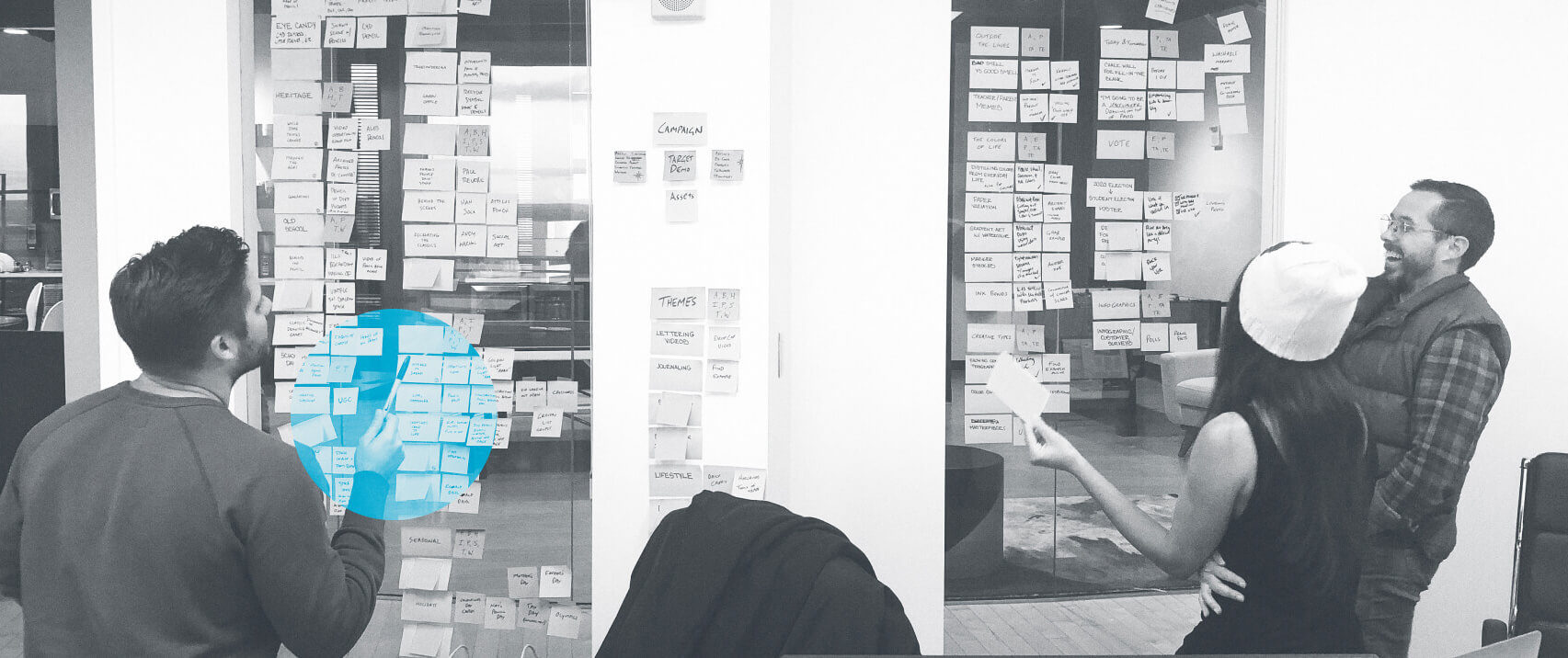
TLC Engineering Project Meeting Kickoff
TLC Engineering COVID-19 Support

Content is interconnected throughout the site, making it easier for users to explore based on their interests.
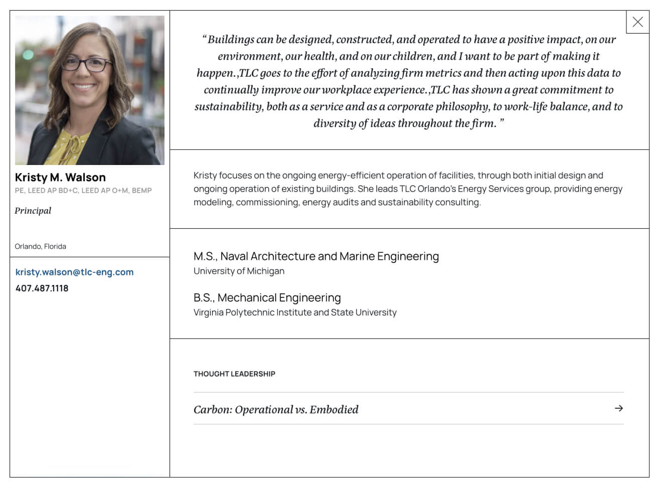
TLC Engineering Culture & People Pages

New Culture & People pages target prospective employees and include links to articles and projects associated with selected team members.
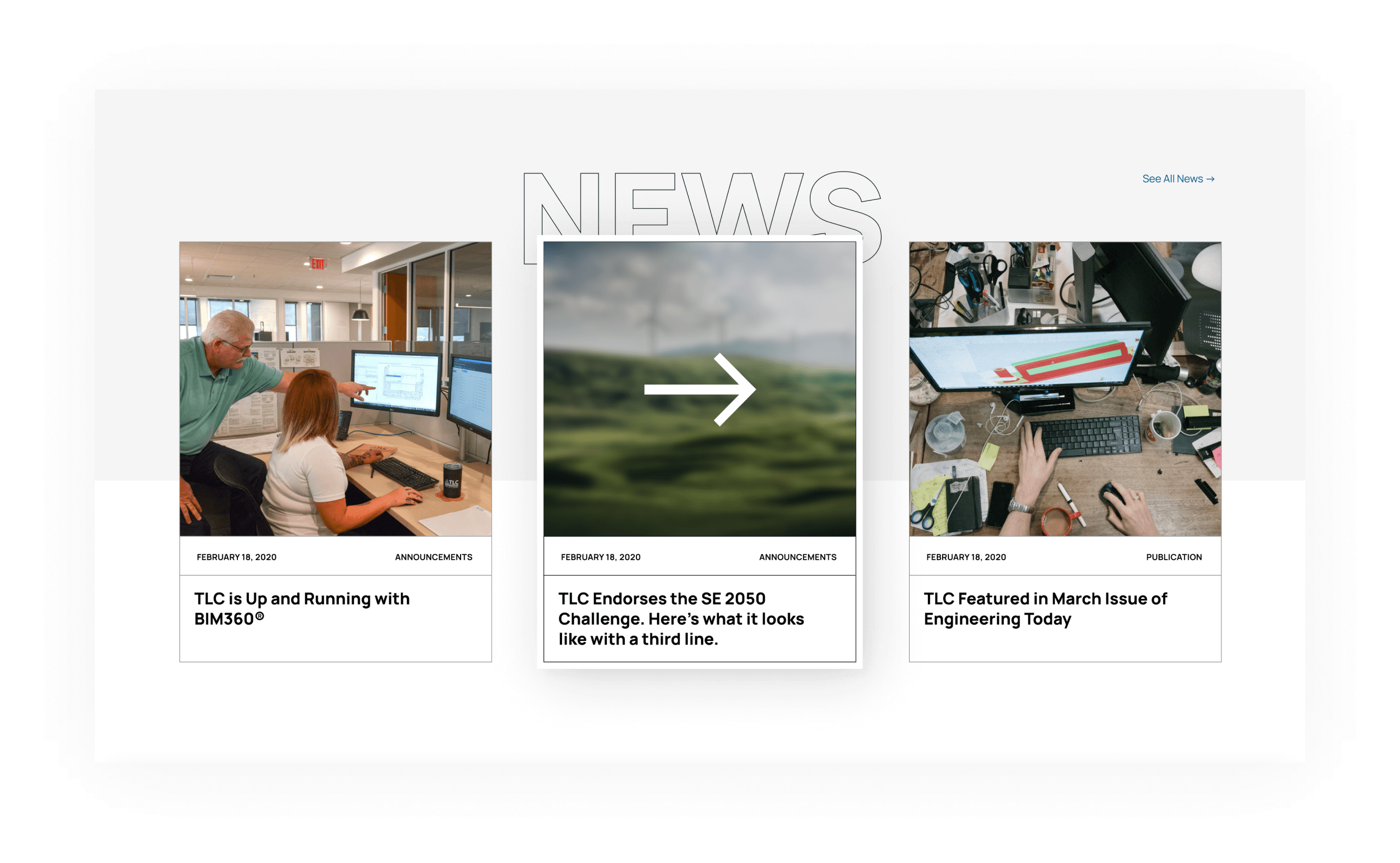
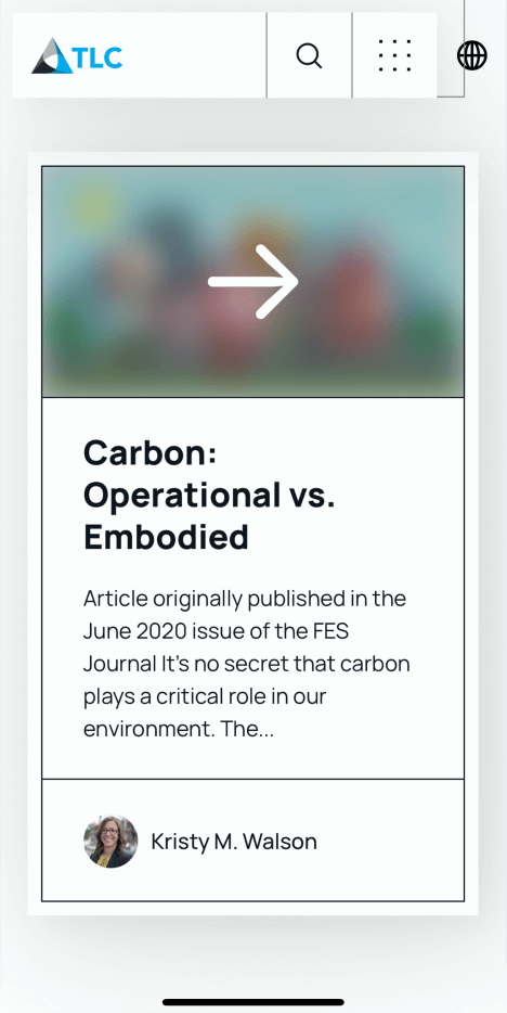
TLC Engineering Website News Slider
TLC Engineering Case Study Example
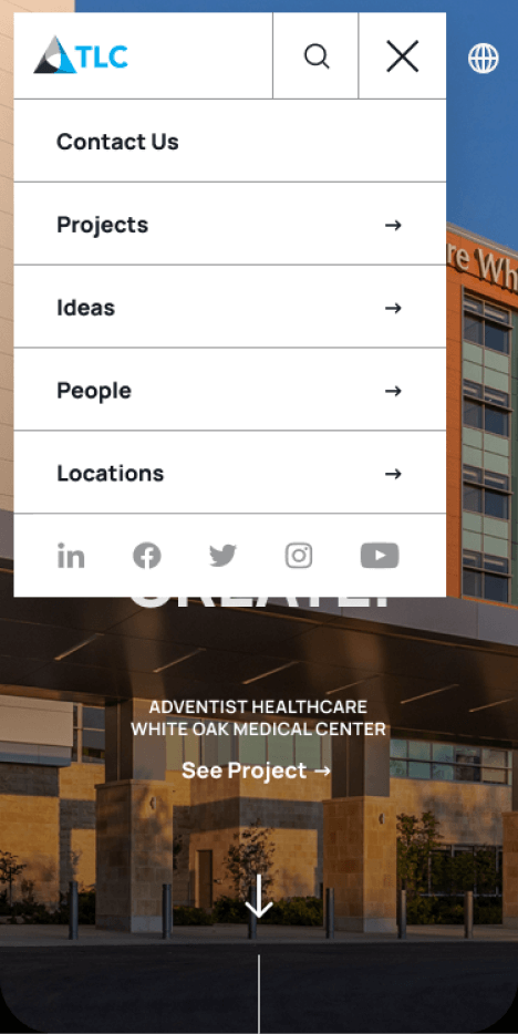
TLC Engineering Website Menu
TLC Engineering Project Location Example

The website uses structural lines and architectural signatures to organize content and highlight functionality. Essentially, engineering at its core.

TLC Engineering Website Menu Header
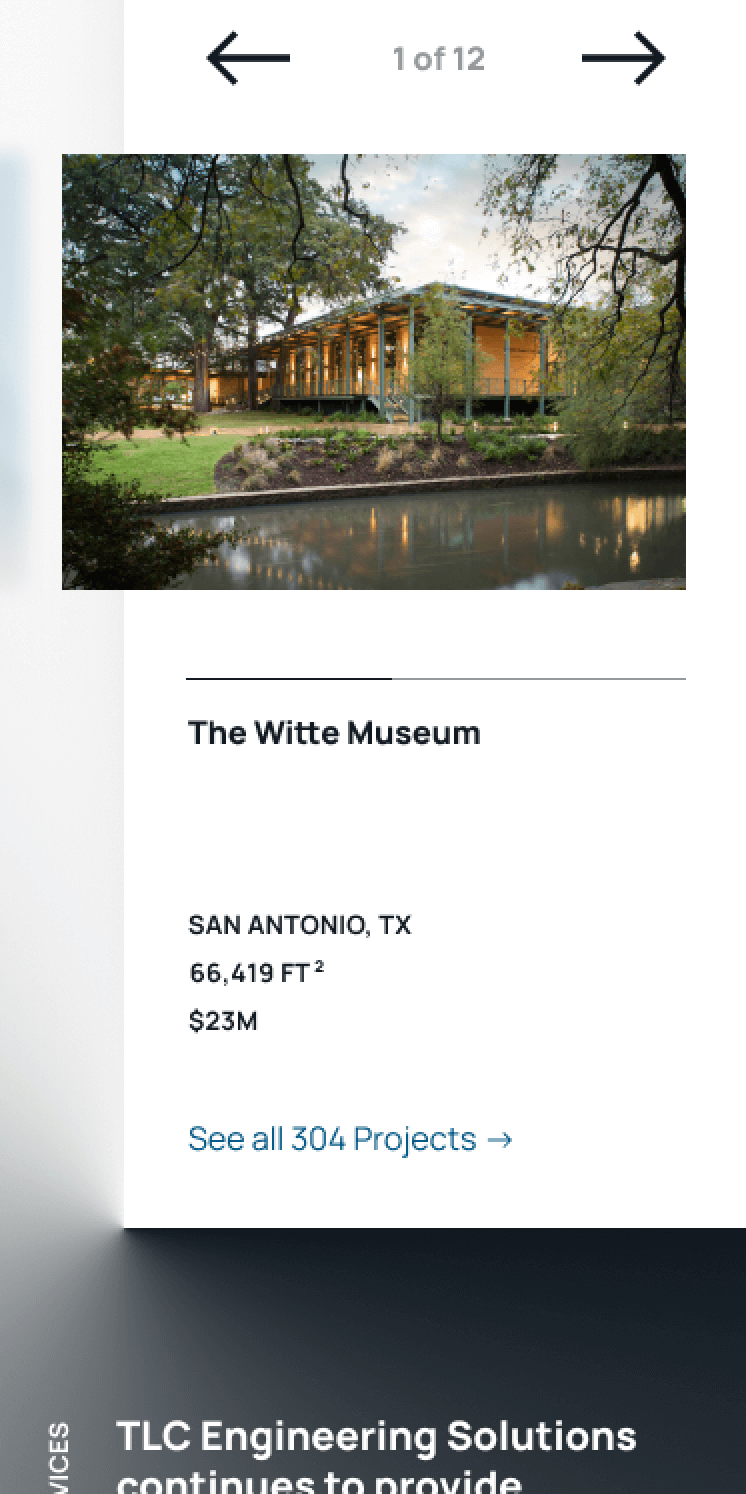
TLC Engineering Project Description
TLC Engineering Portfolio Cursors

TLC Engineering is a nationally recognized engineering firm. Founded in 1955 and consistently ranked among the nation’s largest MEP and structural engineering firms, they provide high-performance engineering design, consulting, and energy services.

TLC’s existing website wasn’t converting well as a sales tool, particularly on mobile. With their 65-year anniversary coming up, they needed a digital experience that matched their history and reputation. They also needed better customization and editing access. This partnership centered around the goal of creating a more engaging web experience, improving how potential clients, existing clients, and potential employees interact with TLC, and presenting the engineering firm as an industry leader.

Plotting More Intuitive, Engaging Journeys

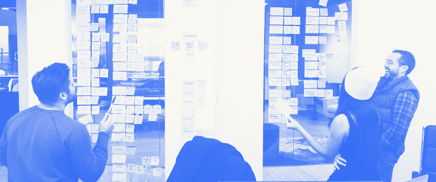
The TLC partnership began with a 43-page web audit to assess how user interface (UI), user experience (UX), and frontend / backend functionality could be improved. Following the assessment, a strategy session broke down TLC’s website piece by piece to identify their target audiences and how each engages with the brand online. This helped determine what information users are after, how they interact with the website, and what features and messaging would improve that experience.

Content Strategy

In an age of scrolling and skimming, it’s crucial to not only have clear hierarchy and structure throughout, but visual interactions that keep readers interested and drive them to the appropriate content. Workshops and processes helped shrink the website’s information architecture, providing fewer navigational buttons and more intuitive, direct paths to content. Instead of trying to appeal to the masses, a higher percentage of content focuses on connecting to needs and motivations, bringing users down their intended marketing funnels. Fresh keyword research and metadata descriptions help attract the right audiences.

Building New Bridges: Industry Thinking

TLC believes in thinking boldly, listening attentively, and creating passionately. In business for more than six decades, the engineering firm loves to share their knowledge with colleagues through mediums like industry articles and continuing education courses.

Clear content and impactful visuals show the engineering brand as an industry leader. Like the new Ideas section, which houses trade papers, a smoother class registration process, and organized insights from the TLC research & development arm, PEAK Institute. The Leadership and Ideas sections fit two goals that TLC expressed during the Website Discovery Session: 1) more prominent thought leadership and 2) a more prevalent, easily accessible news section. New Culture & People pages target prospective employees and include links to articles and projects associated with selected team members.
Drawing Inspiration From the Industry

Borrowing inspiration from the architecture, engineering, and construction (AEC) industry’s pre-CAD era, the website uses structural lines and architectural signatures to organize content and highlight functionality. Essentially, engineering at its core.

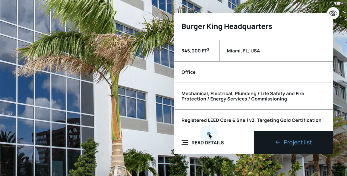
Title blocks are usually located in the corner of AEC drawings and serve two main functions, both in engineering and TLC’s website design:

1. As an organizational framework. Title blocks traditionally contain important information for each drawing, like its title, citation requirements, site name, and—most importantly—the name of the vendor. It made sense to utilize as our source of navigation.

2. As a brand signature. Just as famed American architect Frank Lloyd Wright brought “the hand” to the fore as a brandmark, the title block is treated as a brand asset, giving it strict stylistic rules and responsiveness. Presented within the context of the block, this view of TLC’s logo is typically reserved for client partnerships.

Interacting with the website feels physical, with its focus on interactions that play on light and shadow. Cursors demonstrate both the final product and underlying process by giving a glimpse at what’s behind each visual rendering and plan. Each section of the site down to the article captions is treated like a wireframe, emphasizing the structure’s function like a blueprint.

Engineering Something Better

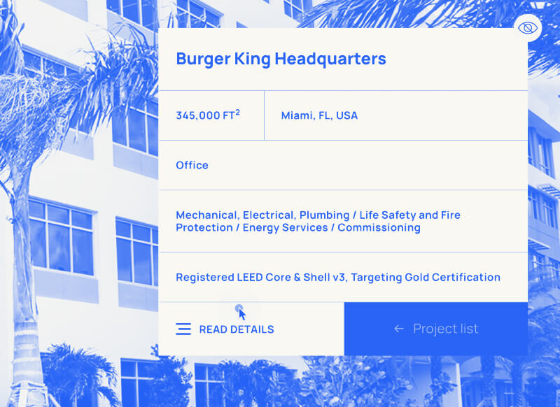
TLC Engineering Burger King Headquarters Portfolio Page
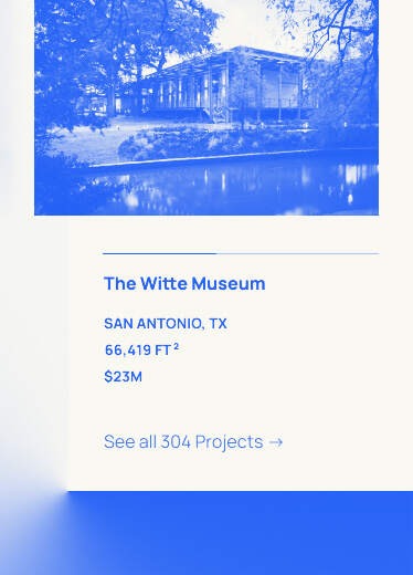
TLC Engineering The Witte Museum Portfolio Page

Aesthetically and functionally, TLC’s website is timeless and built to last. It can withstand heavy loads of data and support more years of ever-growing portfolios, rosters, and industry education.

Speed and responsiveness were major priorities for TLC. Staged on WordPress, their website contained more than 300 projects, 1000+ items in the media library, and a roster of more than 80 team members.

Now TLC can easily share a link at a client lunch or walk a vendor through a project site on their phone without worrying about technical difficulties. With smooth navigation and fast download speeds, viewers get excited and invested in the content they’re seeing.

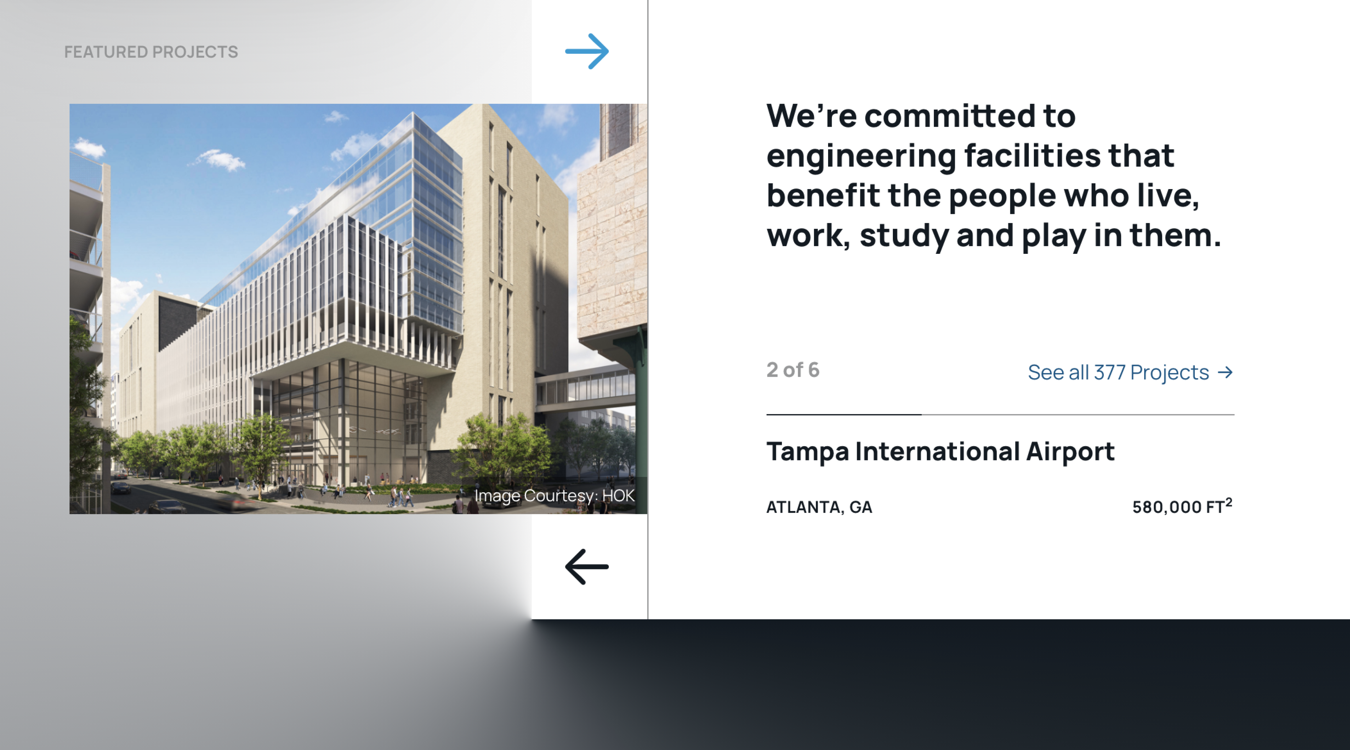
The new Portfolio page skips the expected downward-scrolling page experience. Styling tricks make page navigation easier on browsers while still delivering a noteworthy experience—meaning no heavy special effects libraries bogging down load times.

TLC’s new website launched August 2020. With a deep focus on the architecture of design and content, its immersive experience pulls the user in and draws them down their specific funnel. Where do you want to drive your customers? Fill out the form below or call Alyse so we can come alongside your big vision.

© Big Vision 2024