RumbergerKirk

A 40-year-old national law firm needed a brand experience that stayed true to their successful past while putting their future into focus.

The challenge was not for RumbergerKirk to stand out from competitors, but to understand how to connect the new brand to the unchanging values they’re known for. This was accomplished visually, primarily through a careful balance of white space with their new color palette.

Rumberger.com is contemporary and sleek without using so many modern tech styles that the firm’s reputation and legacy were lost. There’s new energy and vibrancy that viewers experience while scrolling through the website.

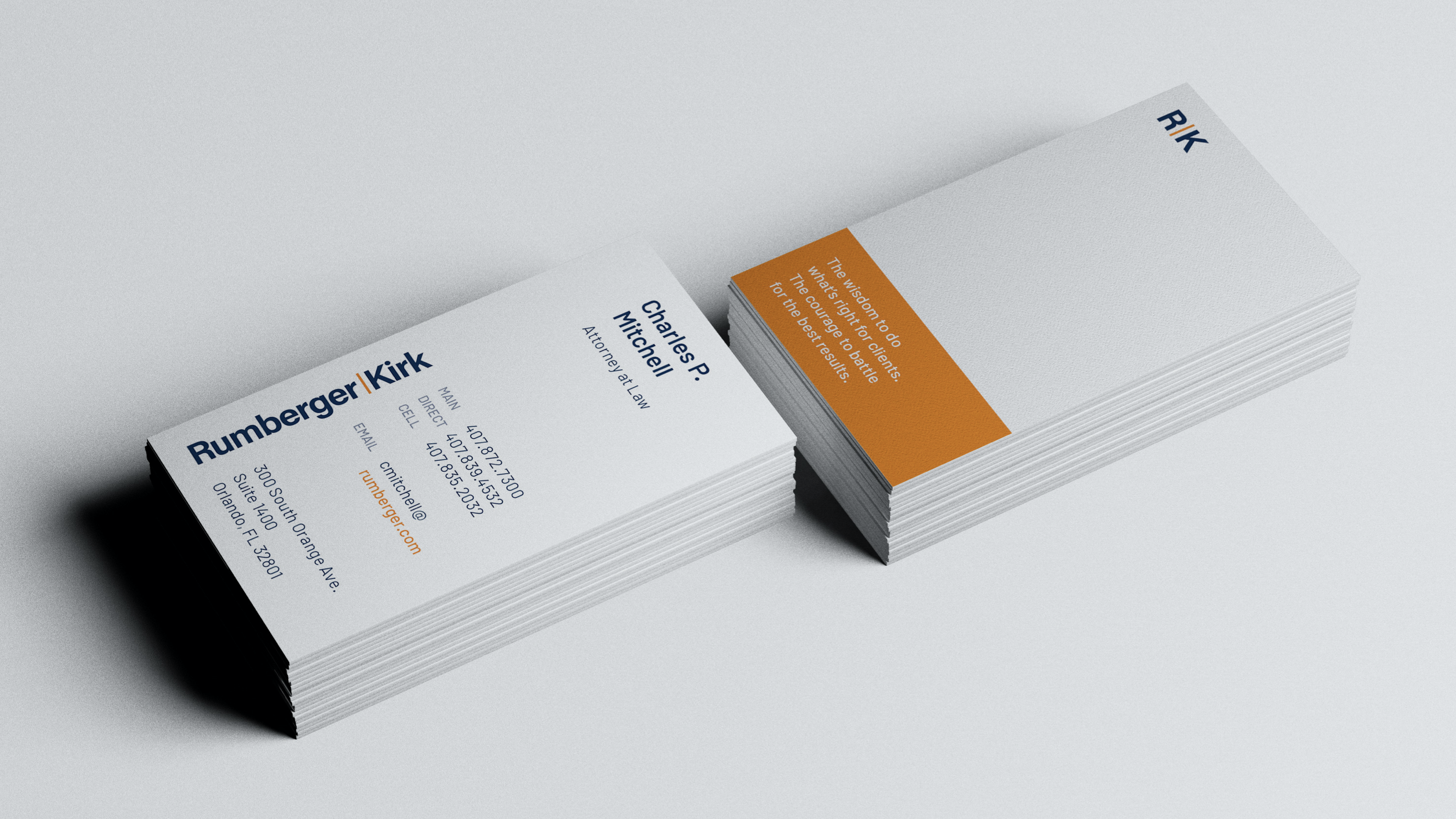
The result? An award-winning rebrand for RumbergerKirk that speaks to their core, from a polished brandmark and sleek website to dynamically lit photography, eye-catching print materials, and a comprehensive launch plan to share it all with the world.

Winner
“Communications: Brand Enhancement” category at the 2020 Legal Marketing Association Southeast Region's Your Honor Awards
2020 Silver District ADDY Award
2020 Gold ADDY Award

RumbergerKirk wanted to provide a sleek, modern web experience, but not at the expense of overpowering the firm’s legacy. 

RumbergerKirk Big Vision
RumbergerKirk Mobile Website
RumbergerKirk Mobile Website About
RumbergerKirk Mobile Website Practice Areas

We partnered to create a comprehensive brand experience that spans every touchpoint, staying true to their successful past while putting their future as RumbergerKirk into focus.
RumbergerKirk Big Vision

RumbergerKirk exudes confidence without being pretentious, meeting clients and recruits where they are and addressing their needs first.

When a law firm with a 40+ year history changes their name, it’s a big deal. Rumberger, Kirk & Caldwell knew they needed a strong brand to start this new era on the right foot. So we partnered together to create a comprehensive brand experience that spans every touchpoint, staying true to their successful past while putting their future as RumbergerKirk into focus.

The result? An award-winning rebrand for RumbergerKirk that speaks to their core, from a polished brandmark and sleek website to dynamically lit photography, eye-catching print materials, and a comprehensive launch plan to share it all with the world.

Building the Case: Brand Identity

A commercial litigation law firm since 1978, RumbergerKirk’s 90+ trial attorneys represent clients across the country in a variety of legal matters that confront the modern business. They deliver tough, zealous advocacy and litigation expertise to all cases, treating every client’s business as if it were their own.

The firm was changing. Pressing forward into a new chapter of growth and success, it was time for the brand to follow suit. To reflect the firm’s core values and brand promise: to do what’s right for clients and battle for the best results.

These brand identity markers were concepted through a brand strategy session that allowed both of our teams to come together and think deeply and collaboratively about who the firm is and what matters most to the firm’s clients. The resulting strategy showed RumbergerKirk’s team and ours that the brand should reflect both where the firm has been and where it’s headed.

This collaborative strategy showed it was important to keep RumbergerKirk competitive with larger national firms, especially when it comes to attracting new clients and top talent, while also keeping an energetic and lively spirit that is core to the firm. RumbergerKirk is not your old, stale firm. It’s thriving with opportunity and vibrant people in every stage of their law career.

Shaping RumbergerKirk’s voice was an integral part of the rebranding process. Many law firms sound much of the same, writing copy that’s dry, literal, and devoid of warmth and personality. In contrast, RumbergerKirk’s copy is smart and warm—written by people for people.

Trust
RumbergerKirk practices law with integrity. They address clients’ needs first with caring determination.

Mentorship
RumbergerKirk passes on wisdom and battle-tested experience. Their voice is confident and affirming.

Courage
They do what’s right for their clients, with tenacity and purpose. RumbergerKirk is inspiring and truthful, strong, and direct, without sounding arrogant.

Diversity
The firm embraces their differences because they make them stronger. RumbergerKirk’s voice is welcoming and accepting without compromising their standards.

Law brands are not normally known for creative execution. The challenge was not for RumbergerKirk to stand out from competitors, but to understand how to connect the new brand to the unchanging values they’re known for. This was accomplished visually, primarily through a careful balance of white space with their new color palette. This parity is seen down to the photography, where the lively orange and a confident blue have been adapted into each headshot and culture image.

For The Record: Website

We wanted to provide rumberger.com with a contemporary and sleek experience without using so many modern tech styles that the firm’s reputation and legacy were lost. As thought leaders that have been in the business for more than 65 years, RumbergerKirk has an expansive blog filled with news and insights. Thanks to powerful fuzzy search in the header, first-time visitors and potential leads can now easily research specific topics, ultimately positioning RumbergerKirk as their knowledgeable source and valuable partner.

When it came to the challenge of attracting young legal talent, rumberger.com needed to be distinctly different from your typical law firm website. Today’s law school graduates are highly attuned to modern technology and a fresh, modern, and mobile-friendly website might be the impression needed to sway a talented young attorney to choose RumbergerKirk over another firm. RumbergerKirk also highly values the diversity of their team and wanted to ensure the website celebrated that as well. We worked closely together to provide thoughtful use of language and imagery, supporting the fact that many backgrounds can find success at RumbergerKirk.

The website also supports the firm’s large network of lawyers across different campuses. RumbergerKirk has grown to five different offices across the southeast, making it important—and challenging—to keep the wide array of attorneys and content intelligently organized. By providing visitors multiple means for finding the information they need, whether through search or filters, users can quickly navigate to relevant attorneys by practice area, location, industry, or even law school.

The Defense Rests

The RumbergerKirk rebrand received first place in the “Communications: Brand Enhancement” category at the 2020 Legal Marketing Association Southeast Region’s Your Honor Awards. RumbergerKirk’s new website also earned a Silver District ADDY Award and Gold ADDY Award of Distinction at the 2020 American Advertising Awards.

Since launching the rebrand, a common response is that RumbergerKirk now has the appearance of a national firm—a major accomplishment for a bustling regional practice. It exudes confidence without being pretentious, meeting clients and recruits where they are and addressing their needs first.

RumbergerKirk’s new website went live in November 2019 and has seen:

  • An increase of 19% traffic to the Careers page
  • An increase of 44% traffic to the Contact page
  • 48% higher traffic than law and government industry benchmarks
  • Time spent on site improved by 27%
  • Bounce rate improved by 10.5%

There’s new energy and vibrancy that viewers experience while scrolling through its pages. RumbergerKirk’s not a team that needs to prove their intelligence with jargon or lofty words. They do sophisticated work for their clients, and now have a website and new brand to match. How do you want to serve your clients? Fill out the form below or call Alyse so we can come alongside your big vision.

© Big Vision 2024